Horizon School
Website DesignCLient
- Horizon School
Services
- Web design
- UX
- Website Build
Deliverables
- 14+ Pages
- CMS
Other
- SEO
- Analytics

Project Info
Challenge
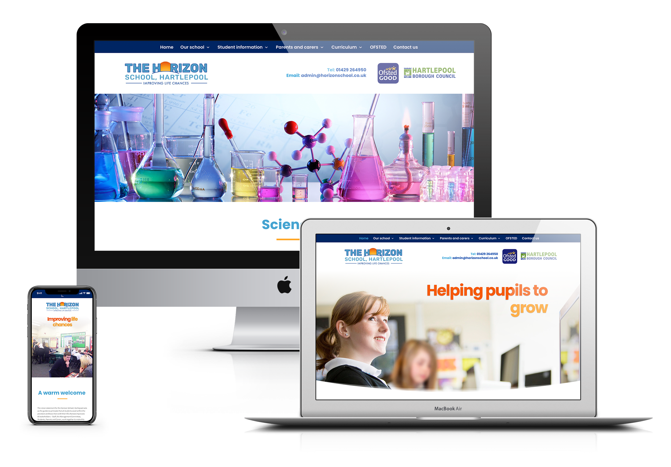
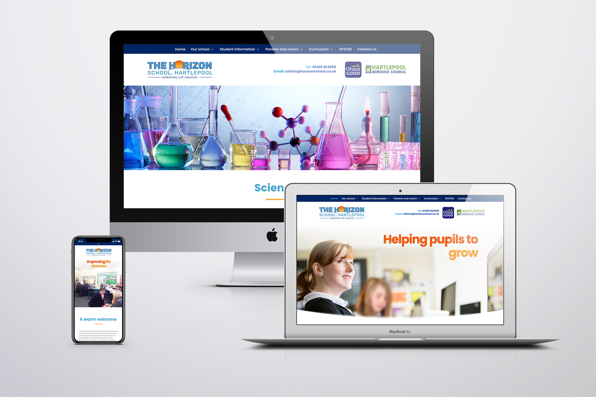
The Horizon School had recently gone through a name change and rebranding exercise and needed a new website which reflected this exciting change. Their existing site was a bit dated and not very user friendly in terms of finding content within the site or working seamlessley on all device types (desktop, tablet, mobile).
The client also needed a new website which would be very easy to update themselves moving forward. All in all the client needed an impressive new site which would showcase all this great school had to offer which has been rated ‘good’ by government OFSTED inspectors.
SOLUTION
At the start of every project in the briefing stage we like to work closely with the client to understand their needs, wants and aspirations with their new site, as well as understand any issues or problems with an existing site so that our solution will be a big improvement. We also get a good understanding of the target audience/personas and their needs (a key UX principle), so the new website improves the users experience.
Once the site-map and content structure was agreed it was onto the wireframing & visualisation stage, to propose a look & feel which would be much more visually engaging than their old website, for example by including more photos to add the personal human touch and a more vibrant colour pallette. Effective site navigation was a key component of this site and the navigation bar remains fixed at the top of every page. Content wise (in both imagery & text) we wanted to focus on a positive angle and promote the schools ‘good’ OFSTED rating where possible, include a range of testimonials and also reinforce the benefits of attending the school throughout the website.
Finally once the site was live, the client was trained on how to update the site themselves and they found it very easy and straightforward. We are pleased to say the website was very well-recieved by the school, students and parents.
HORIZON SCHOOL WEBSITE
A key aspect of this website was assessing the website from a content point of view and understanding what content is of most relevance to the various user personas (pupils, staff, parents, education organisations etc) We then set about proposing a new site-map and navigation structure which would have a clear hierarchy to make key areas of the site really easy to find and navigate too. We also identified where new content was needed and what content off the old site was not very useful to the various audience types and thus surplus to requirements.
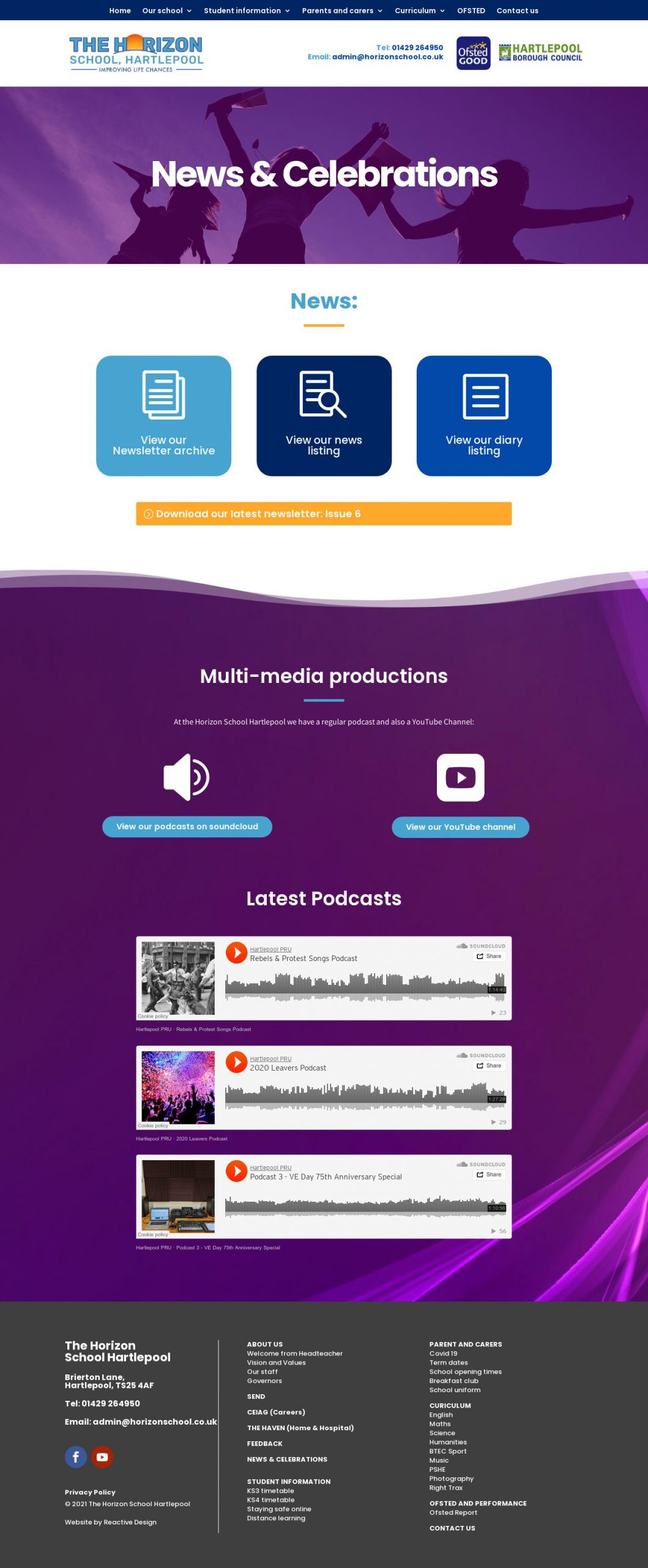
As well as an effective content hierarchy (navigation structure) each page also has an effective visual hierarchy, with consistent application of buttons/call to actions and pages broken into ‘visual chunks’ to make it easy for the eye to move from area to area on the web-page to find content of relevance. By breaking up the page into visual chunks it also makes content look more digestible to read and more accessible.


